| Anscombe's Example | |||||||
| I | II | III | IV | ||||
|---|---|---|---|---|---|---|---|
| x | y | x | y | x | y | x | y |
| 10.0 | 8.04 | 10.0 | 9.14 | 10.0 | 7.46 | 8.0 | 6.58 |
| 8.0 | 6.95 | 8.0 | 8.14 | 8.0 | 6.77 | 8.0 | 5.76 |
| 13.0 | 7.58 | 13.0 | 8.74 | 13.0 | 12.74 | 8.0 | 7.71 |
| 9.0 | 8.81 | 9.0 | 8.77 | 9.0 | 7.11 | 8.0 | 8.84 |
| 11.0 | 8.33 | 11.0 | 9.26 | 11.0 | 7.81 | 8.0 | 8.47 |
| 14.0 | 9.96 | 14.0 | 8.1 | 14.0 | 8.84 | 8.0 | 7.04 |
| 6.0 | 7.24 | 6.0 | 6.13 | 6.0 | 6.08 | 8.0 | 5.25 |
| 4.0 | 4.26 | 4.0 | 3.1 | 4.0 | 5.39 | 19.0 | 12.5 |
| 12.0 | 10.84 | 12.0 | 9.13 | 12.0 | 8.15 | 8.0 | 5.56 |
| 7.0 | 4.82 | 7.0 | 7.26 | 7.0 | 6.42 | 8.0 | 7.91 |
| 5.0 | 5.68 | 5.0 | 4.74 | 5.0 | 5.73 | 8.0 | 6.89 |
MATH60230 - Lecture 5
Plan for Today
- Figures and tables
- Introduction to matplotlib and seaborn
- Publication process in finance
- How to read an empirical paper
Data Visualization
Know Thy Data!
Your results are never more reliable than your data. Are your data reliable?
If your data set is new, people want to get familar with it.
It helps them judge whether your results are reasonable, may give them new ideas, etc.
Some data sets are complicated. How do you “show” them?
References
Sometimes Statistics are not Enough
Descriptive Statistics
| Descriptive Statistics | ||||
|---|---|---|---|---|
| I | II | III | IV | |
| N. | 11 | 11 | 11 | 11 |
| Mean(x) | 9.0 | 9.0 | 9.0 | 9.0 |
| Mean(y) | 7.5 | 7.5 | 7.5 | 7.5 |
| OLS | y = 3.00 + 0.50・x | y = 3.00 + 0.50・x | y = 3.00 + 0.50・x | y = 3.00 + 0.50・x |
| 𝜎(𝛽) | 0.118 | 0.118 | 0.118 | 0.118 |
| t-stat 𝛽 | 4.24 | 4.24 | 4.24 | 4.24 |
| 𝜎²(x) | 11.0 | 11.0 | 11.0 | 11.0 |
| 𝜌(x,y) | 0.82 | 0.82 | 0.82 | 0.82 |
| R² | 0.67 | 0.67 | 0.67 | 0.67 |
Figures
Tufte (2001)’s Advice
A good graph should
- show the data
- lead the reader to think about the data, not the methodology or the design
- avoid distortions that mask what the data have to say
- succinctly present many numbers
- show large amounts of information in a coherent way
- encourage the readers’ eyes to compare different parts of the data
- show different levels of details, from an overall view to the smallest detail.
- have a precise and reasonable goal: description, exploration, tabulation or decoration
- be a coherent part of the whole
How to Make a Good Graph
- Think about what you are trying to show:
- What details can you eliminate?
- What information would be useful to add?
- Maximize
- the data-to-ink ratio
- the fraction of the page take up by data
- Remember that readers are only human
- hard to distinguish more than 5 or 6 lines (esp. without colour)
- too many lines or points in a small space just creates clutter.
- Experiment
- Try to learn from good examples
Example - Probabilities of Fed rate increase
Example - Pre-FOMC Announcement Drift
Printing in Black and White?
Good Graphs - GAPMINDER World
Gapminder’s example shows
- Life Expectency
- GDP per capita
- Population
- Year
- Continent
That’s a 5D data display!
- Hover your cursor, and it adds the country name (6D!)
Python Visualization Libraries
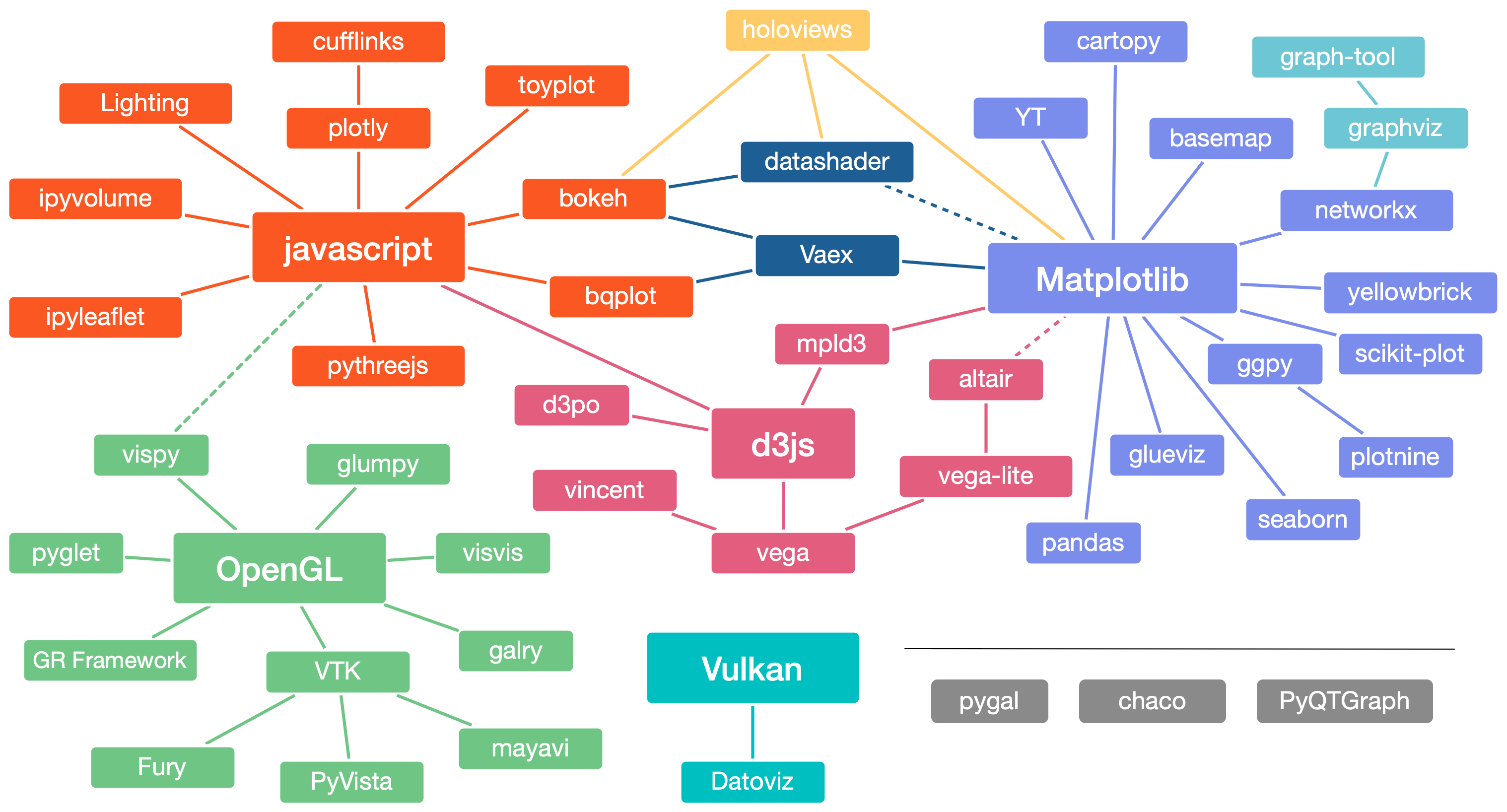
Python Visualization Libraries - My Favorites
- matplotlib - main library
- seaborn - for stats, built on matplotlib
- pandas - uses matplotlib
Dashboards
For interactive dashboards, you can use:
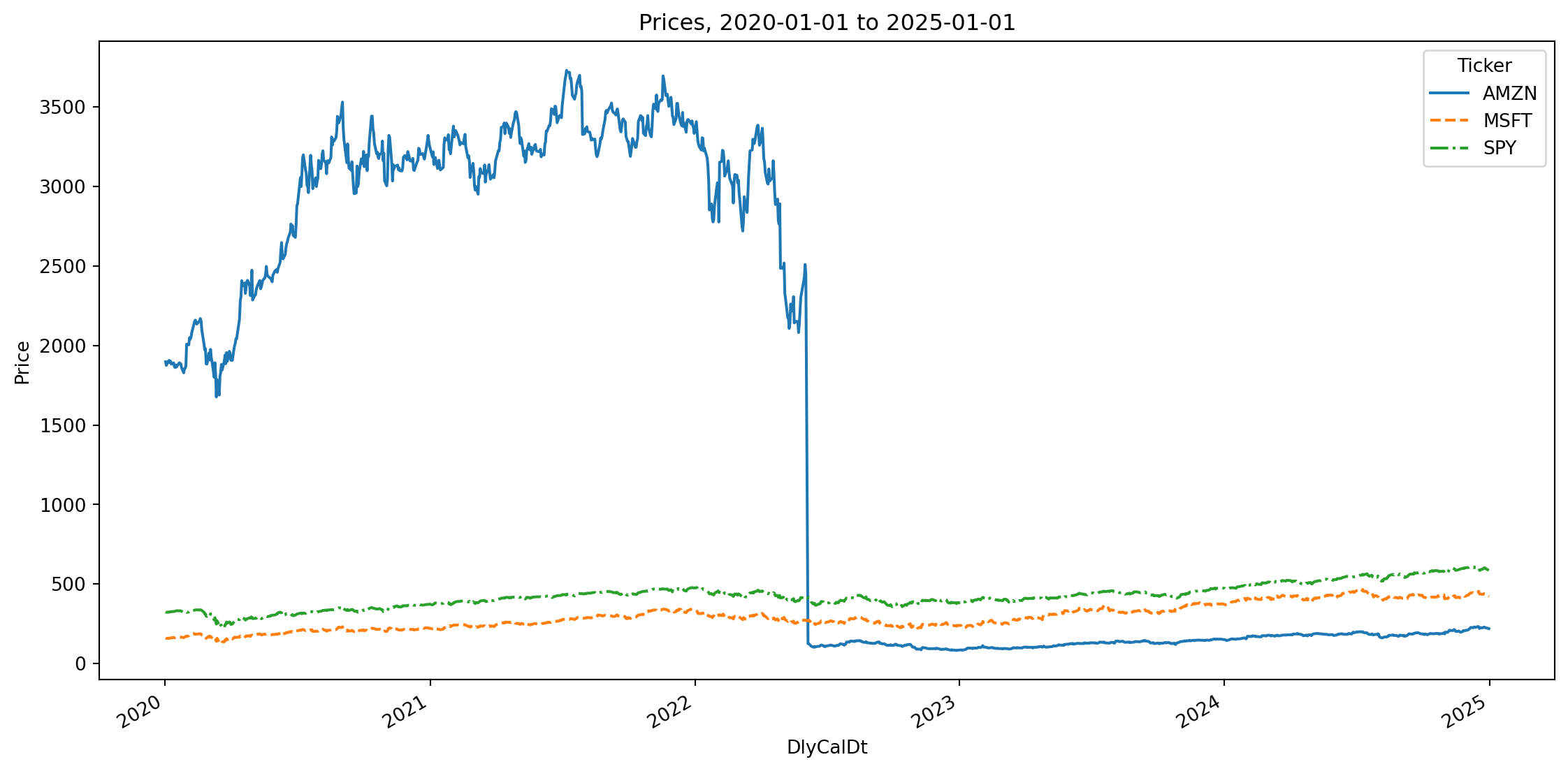
Prices
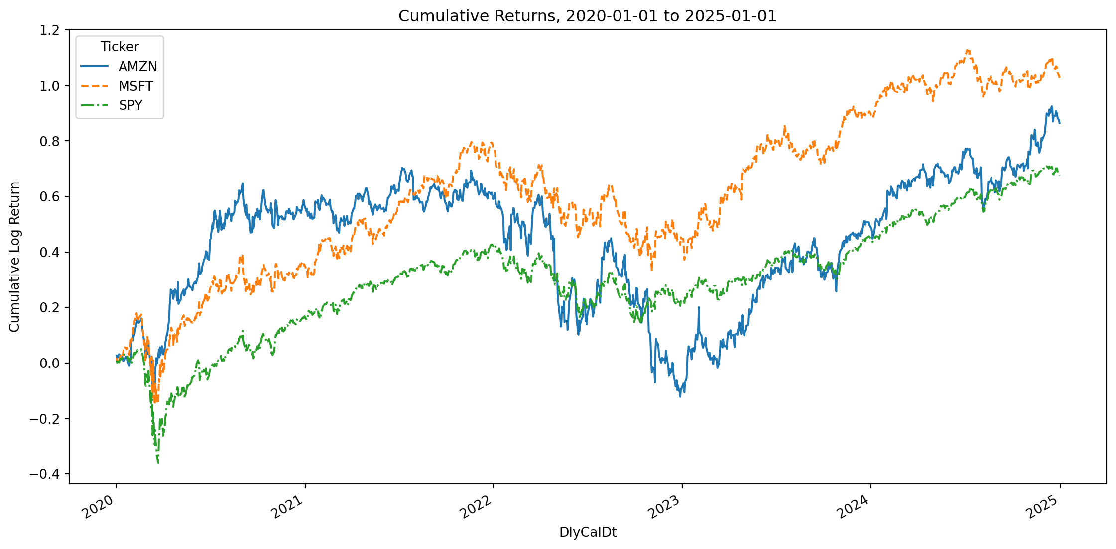
Cumulative Returns
Pitfalls - Returns
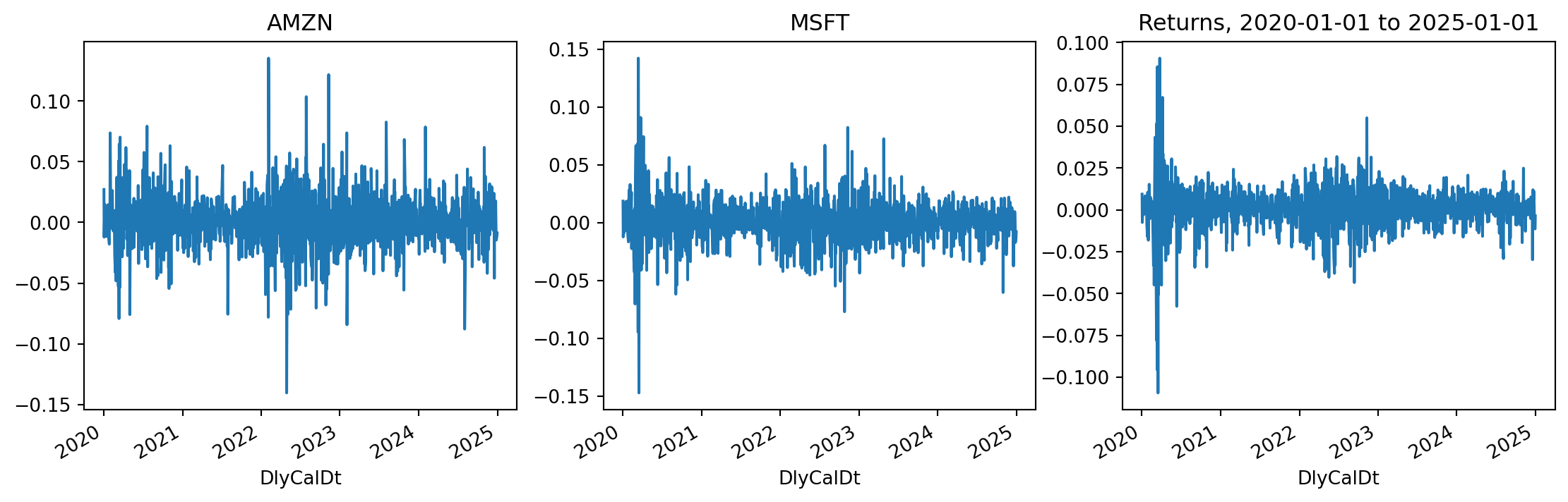
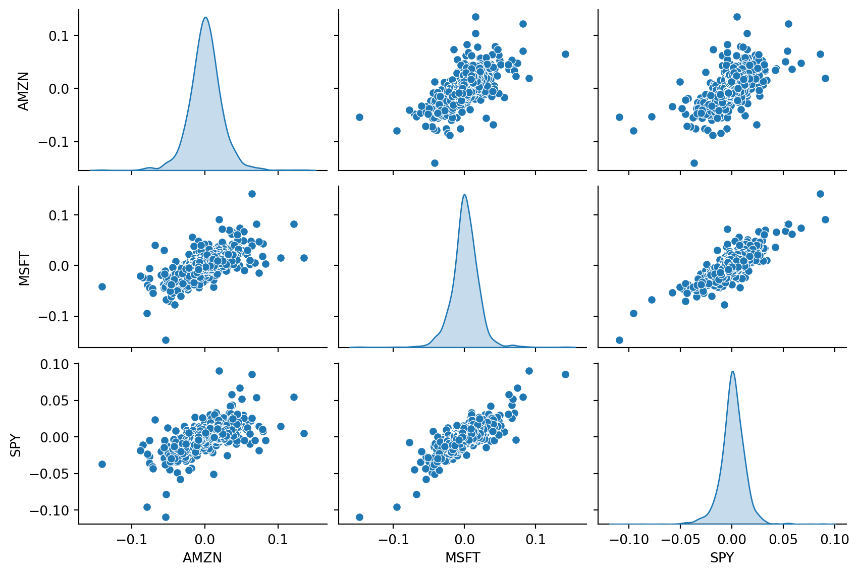
Returns: Correlation and Volatility
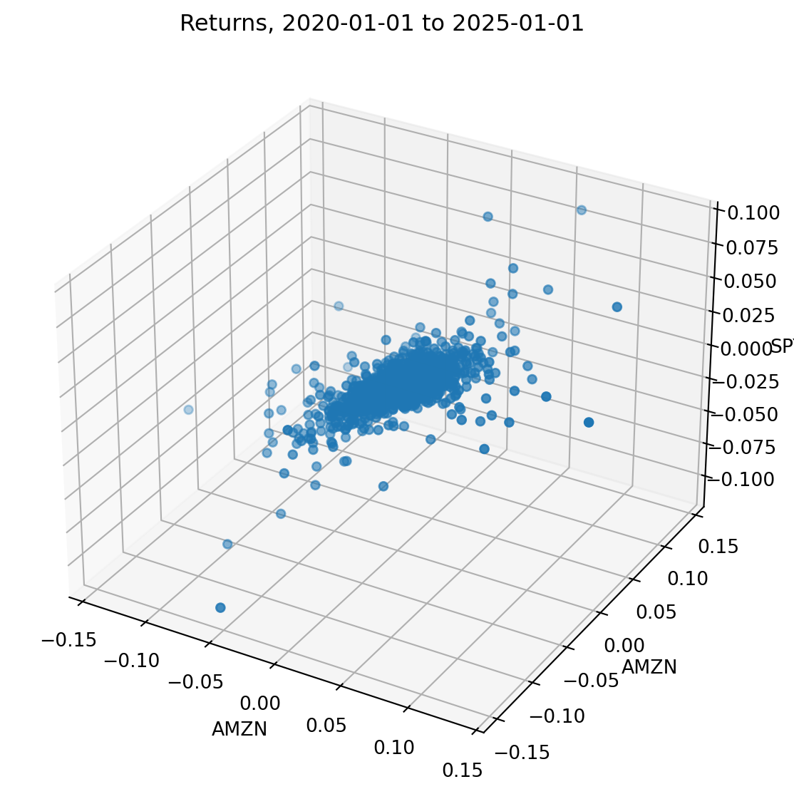
Pitfalls - 3D
What is the most appropriate graph for your data?
See the decision tree from From data to Viz | Find the graphic you need.
Pitfalls
For a discussion of potential pitfall with graphs, see Data to Viz | A collection of graphic pitfalls.
Tables
The same principles also apply to tables. Make it easy for the reader to see the data.
Some suggestions from John Cochrane (author of a well-known asset pricing textbook):
- Use sensible units. Percentages are good. If you can report a number as 2.3 rather than 0.0000023, that’s usually easier to understand.
- Use the correct number of significant digits, not whatever the program spits out. 4.56783 with a std. err. of 0.6789 should be 4.6 with a std. err. of 0.7. Two to three significant digits are plenty for almost all economics and finance applications.
- No number should appear in a table that is not discussed in the text. You don’t have to mention each number separately; “Row 1 of Table 3 shows a u-shaped pattern” is ok. “Table 5 shows summary statistics” (period) is not ok. If it’s not worth writing about in the text, it’s not worth putting in the table.
Captions
Every figure and table should have a caption with the following information:
- Short description of what is presented in the table or figure.
- If regression results, at a minimum list the dependent or independent variable. If complicated regression or panel regression, add formula.
- Variable descriptions (short description, not details about variable construction.)
- Sample description (i.e. time period, stock universe, etc.)
Each caption should be self-contained, so that a reader could just pick up your report and look at the figures and tables without reading the text.
Tables in Python
For tables in Python, you can use the pandas library to export tables to LaTeX or Excel.
pandas:df.to_latex(),df.to_excel()to export tables to LaTeX or Excel. Tables can be formated and styled before exporting.great_tables- (fairly new) library to create nice tables in Python for output to HTML or LaTeX (this is what I use for tables in this presentation).pystout- library to export regression tables to LaTeX.
How to Read an Empirical Paper
- Abstract: what is it about? do I really want to read this paper?
- Introduction: 4-10 pages summary of what is in the paper, motivation, overview of results, literature review
- Data: where is their data from? what information does it contain? how large is their sample? what are the preprocessing step?
- Methodology/analysis/results: read this is you want to know what statistical tests they are doing, what the actual results are
Publication Process in Finance
- Idea!
- First draft: publish on pre-publication repository (no peer-review):
- Present at conferences, seminars, etc.
- Submit for publication
- If “lucky”: Revise and Resubmit (multiple rounds)
- Otherwise revise and submit to another journal
- Paper accepted for publication!
2-3-4 not necessarily in that order
Can be many years (often more than 2 or 3) between (1) and (5).
Academic Journals
The best (according to HEC Montréal’s policy) are the 50 Journals used in FT Research Rank
| Finance | Economics | Accounting |
|---|---|---|
| Journal of Finance | American Economic Review | Journal of Accounting Research |
| Journal of Financial Economics | Econometrica | Journal of Accounting and Economics |
| Review of Financial Studies | Journal of Political Economy | The Accounting Review |
| Journal of Financial and Quantitative Analysis | Quarterly Journal of Economics | Review of Accounting Studies |
| Review of Finance | Review of Economic Studies | Contemporary Accounting Research |
| Management Science | Accounting, Organizations and Society |
Academic Journals (2)
After that, there are many good journals with different objectives:
- General: Journal of Banking and Finance, Journal of Empirical Finance, Quarterly Journal of Finance, etc.
- Specific topic: Review of Asset Pricing Studies, Review of Corporate Finance Studies, Journal of Financial Markets, Journal of Financial Econometrics, etc.
- Different type of article: Critical Finance Review, Economic Letters, Journal of Economic Perspective, etc.
- Aimed at practictioners: Financial Analysts Journal, Risk, etc.
Is it a fake journal? Check the Web of Science Master Journal List
Next lecture
- Review of statistics and probabilities
- Bayes’ formula
- Estimators
- Classical hypothesis testing
- Confidence intervals
- Goodness of fit tests/QQ plots/KDE estimators
References
Anscombe, Francis J. 1973. “Graphs in Statistical Analysis.” The American Statistician 27 (1): 17–21.
Boguth, Oliver, Vincent Grégoire, and Charles Martineau. 2019. “Shaping Expectations and Coordinating Attention: The Unintended Consequences of FOMC Press Conferences.” Journal of Financial and Quantitative Analysis 54 (6): 2327–53.
Cochrane, John H. 2005. “Writing Tips for Ph. D. Students.” https://www.johnhcochrane.com/s/phd_paper_writing-9llk.pdf.
Knaflic, Cole Nussbaumer. 2015. Storytelling with Data: A Data Visualization Guide for Business Professionals. Wiley.
Rougier, Nicolas P. 2021. Scientific Visualization: Python + Matplotlib. Edited by Nicolas P. Rougier. https://inria.hal.science/hal-03427242.
Tufte, Edward R. 2001. The Visual Display of Quantitative Information. 2nd ed. Cheshire, CT: Graphics Press.
Wilke, Claus O. 2019. Fundamentals of Data Visualization: A Primer on Making Informative and Compelling Figures. O’Reilly Media. https://clauswilke.com/dataviz/.
![]()
MATH60230